Origin®
Brand Studio, DubaiDubai

Journal

Journal

Journal

Designing for a station wall, not a phone.

Designing for a station wall, not a phone.

Designing for a station wall, not a phone.

Out-of-home gets read in two seconds from twelve metres away. Here is what survives that distance.

Out-of-home gets read in two seconds from twelve metres away. Here is what survives that distance.

Out-of-home gets read in two seconds from twelve metres away. Here is what survives that distance.

Topic

Identity

Published

Reading time

3 minutes

Written by

Portrait of Carlisle Stevens, Art Director

Carlisle Stevens

Art Director

·

Origin®

Topic

Identity

Published

Reading time

3 minutes

Written by

Portrait of Carlisle Stevens, Art Director

Carlisle Stevens

Art Director

·

Origin®

Topic

Identity

Published

Reading time

3 minutes

Written by

Portrait of Carlisle Stevens, Art Director

Carlisle Stevens

Art Director

·

Origin®

A lit digital poster for Dendezeiro stands on a metro platform, with a train blurred behind it.

A Dendezeiro poster on a metro platform, seen from where most people read it.

A lit digital poster for Dendezeiro stands on a metro platform, with a train blurred behind it.

A Dendezeiro poster on a metro platform, seen from where most people read it.

A lit digital poster for Dendezeiro stands on a metro platform, with a train blurred behind it.

A Dendezeiro poster on a metro platform, seen from where most people read it.

Most identity work now gets judged on a phone. A designer zooms in, a client takes a screenshot, and everyone agrees from twenty centimetres away. Out-of-home doesn't give you that distance. A poster on a metro platform gets two seconds from someone twelve metres away, walking, with a bag on one shoulder.

We design for that person first. If a poster works for them, it works on a phone. The reverse is rarely true.

What survives twelve metres

One message. A platform poster has room for a name, one line and one picture. A second line gets read by the people already standing still, and they are not the ones you need.

Big type, set heavy. A common rule gives 25 mm of letter height for every three metres of distance, so 100 mm at twelve metres. We set headlines larger than that and check them from the far end of the studio, not on a monitor.

Contrast that holds in bad light. Platforms are lit from above, the glass reflects, and trains throw shadows. Mid-grey on light grey disappears. We test colours on paper, under a fluorescent tube, before anyone signs them off.

One picture with one subject. A busy photograph turns into texture at a distance. A single figure or a single product holds.

A striped pink, green and yellow shop awning printed with the Toki wordmark and the line 'Place for your everyday ritual'.

Toki's awning: one name and one line, read from the kerb.

Nobody on a platform stops to read a poster. If it needs them to stop, it has already lost.
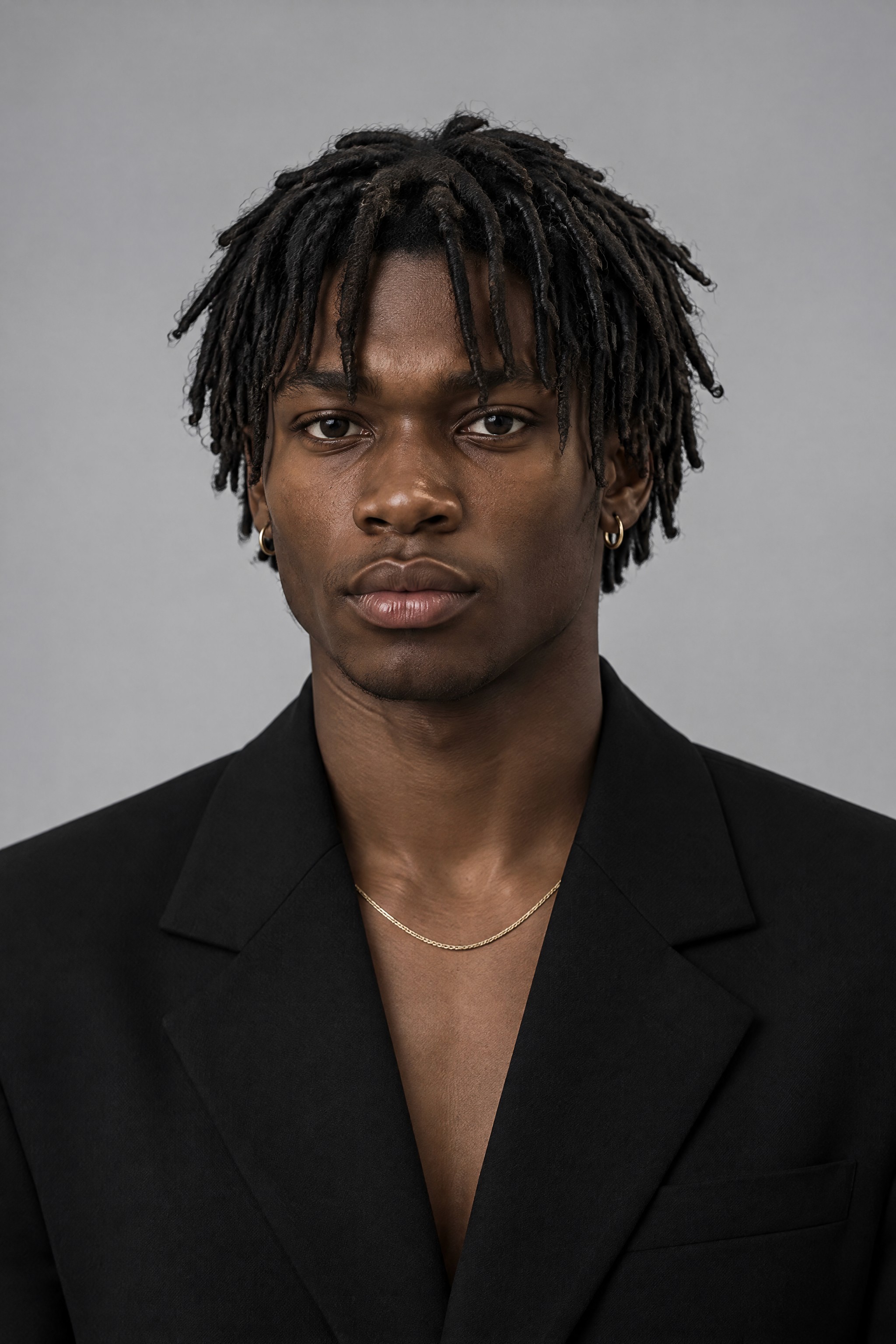
Portrait of Carlisle Stevens, Art Director

Carlisle Stevens

Art Director

·

Origin®

How we check it

We print every poster at full size, or at a scale we can walk back from, and tape it to the long wall at Lime House. Then we walk past it at a normal pace and say what we saw. If two of us name different things, the poster is doing two jobs and will lose one of them.

For Reform's launch, the station poster carried the stacked RE / FORM mark, one line and one photograph from the shoot. The first draft had a second line about salvaged denim. It came off after the walk test. Nobody had read it. The poster that went up had three things on it, and people saw all three.

Then the phone

Only after the wall do we fit the same design to a screen. It usually needs little. A layout that holds at twelve metres has already lost the details a phone would have flattered.

What does change is the crop. A platform poster is tall, and a feed is square or taller still, so we mark the safe area on the first draft, not the last. The name and the one line sit inside it from the start.

The wall is the hard test. Pass it, and the phone follows.

Portrait of Carlisle Stevens, Art Director

Carlisle Stevens

Art Director

·

Origin®

Runs the listening days and every shoot. You see the selects the same day.

Runs the listening days and every shoot. You see the selects the same day.

An iced matcha latte in a clear cup on the corner of a grey concrete bench, with the YUZU name set into its side.

Up next

Photography

15 August 2026

Shooting on concrete instead of seamless.

A grey floor tells the truth about a product. Why our sets got rougher this year.

Portrait of Carlisle Stevens, Art Director

Carlisle Stevens

Art Director

·

Origin®

Start from the origin point.

Every brand we build begins with one conversation. This is where yours would.

Book a call

Start from the origin point.

Every brand we build begins with one conversation. This is where yours would.

Book a call

Start from the origin point.

Every brand we build begins with one conversation. This is where yours would.

Book a call